Let’s face it. Presentations are a big part of what we need to do to keep our teams aligned and communicate the value of our products and services.
Some people seem like naturals, while the rest of us struggle to create or deliver presentations that keep anyone’s attention. Sometimes we dread them.
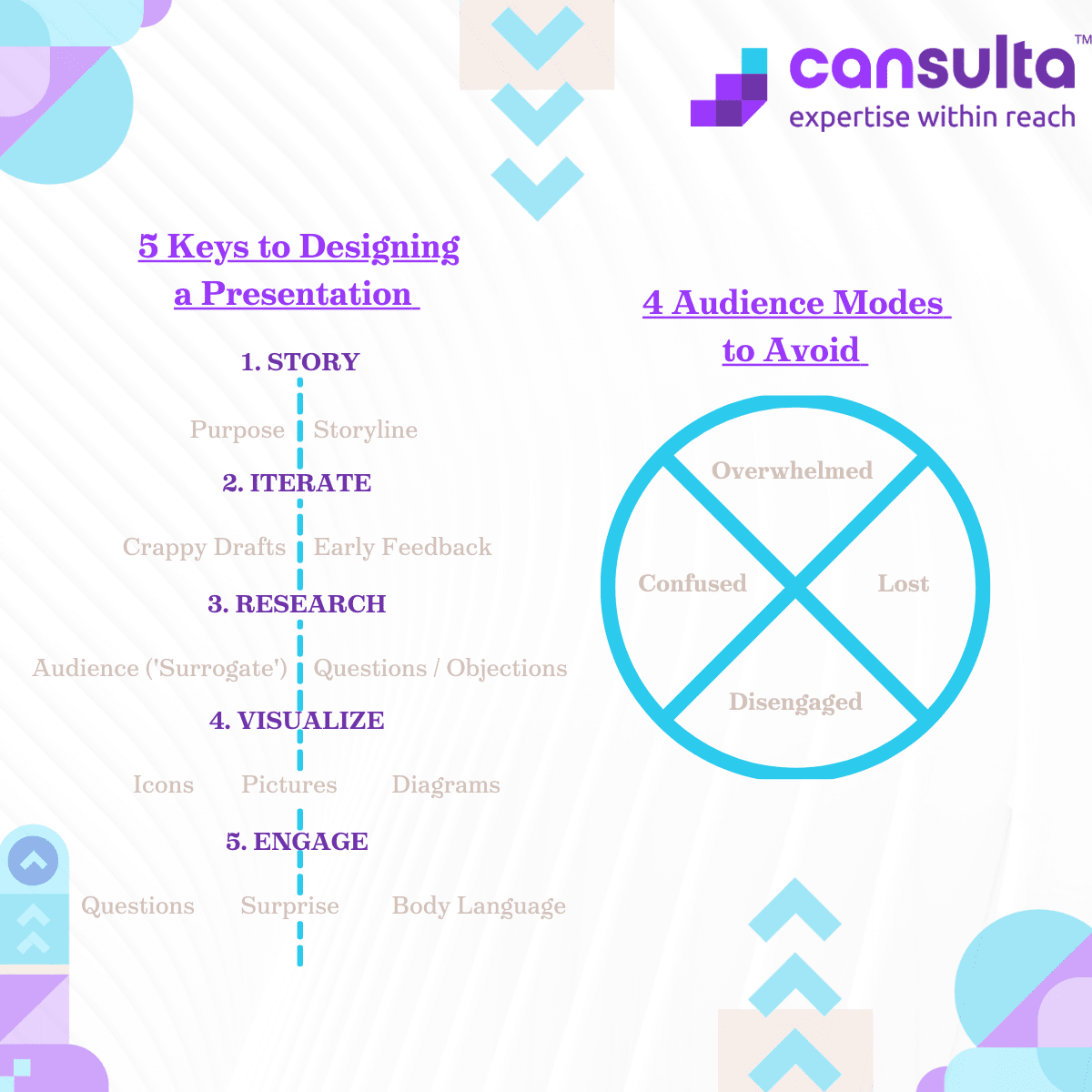
Don’t worry, we have you covered with the 5 keys you need to learn to start designing presentations that get people talking.
1. Story
I want you to keep this first word in mind – Story. If you are going to design a presentation, you have to imagine you’re telling your audience a story.
One of the most important things when telling your story, is to ensure that your presentation has an overall purpose. That purpose should be really clear. I would encourage you to literally write this in the presentation, ‘after today you are going to walk away with these things…’
I also want you to think of a storyline. My recommendation with any presentation is that you lay out your slides in a sequence. How? Get your ideas down on paper. I want you to string them along in a big line from start to finish.
There are two parts that you should be thinking about when you’re talking about your story:
- You need to make a logical connection between each of your slides, and each slide should have one main point.
- The word is emotional connection. Just like a movie. What kind of movie would your presentation be? How is the flow of the story going to work? Emotion is a critical one.
What you can do in your presentations (and I love this!) is getting down into the weeds a little bit. But, if you have a slide where you take some shapes, number them, and for each one of these, I want you to think about two points. What’s the logical connection between each slide? And, if your presentation was meant to be a movie, what are the emotional highs and lows in your movie? Beneath all of these slides, talk about the journey that you want your audience to go through. For example, if your story starts off at a really high point, and then the rest of the movie or the rest of your story is a decline into tragedy and difficulty, then you’re going to map a high emotional point up near the beginning slides of your presentation, and you’re going to have the lowest points mapped against your slides as well.
This is a really great way to ensure that any changes you make to your storyline still match your overall flow for your story. And so that the logic between your slides makes sense. If you can’t see clearly how slide four logically leads to slide five, then you’re probably missing something in your presentation sequence, or you perhaps have too many slides in your presentation.
2. Iterations
Number two, I use this word iterations. Just like when designing anything, the point of iterations is you want really quick loops where you’re getting thorough feedback. So, you’re looking for early feedback from your audience. I’ll get into that in a minute on point number three. But the whole point of iterations is to defeat two of the things that will hold you back in putting together your presentation.
One is the management of your time resources, and two is your management of your own procrastination. What I want you to do is I want you to create really crappy first drafts of all of your slides.
If you think you can do a few slides in a day, try to complete the entire presentation in one day, try to do half-that, try to do it in half a day. If you can do the next step in your presentation, half a day, time box yourself to an hour. The point of doing this is without pushing the pace so you can get feedback, you will spend a whole bunch of time working on things that you think are working, and you’ll end up throwing out a lot of your work, especially in presentations.
Designing your presentations really requires this early feedback and crappy first drafts of everything. Don’t spend 20 minutes trying to find the right picture by Googling it, draw a picture of what you’re going to put there. Take that picture, go show it to either a friend or a manager who it’s for, or somebody that’s representative of your audience, and say: “what do you think of this?”
3. Research
Key number three – here’s a big one – is research. I want to point out a couple of key points with research. First, if you’re reading this, how many of you would say that you have a really great grasp on your audience when you’re presenting? Some people do. Some people will say: “I’ve been that person in the audience for years and I totally understand their mindset.” But if you’re presenting a lot of the challenges, especially for those of us that are presenting a new field or are doing it for the first time for a certain audience, we actually don’t know our audience.
We have no idea what they think or what they want. And you’ll hear people tell you this all the time, like, “oh, you have to know your audience.” It’s just not that easy. You’re not going to know your audience unless you have expertise in that area. So this is counter-intuitive, but don’t try. Don’t waste your time. Here’s a better suggestion. Find your surrogate. You need to find somebody who can stand in and be representative of your audience. At least one. If you can get a whole group like a miniature little focus group of people, that’s great. Even if it’s just your manager who is representing the executives – awesome. If it’s a friend who works in that field or a colleague who’s representative of your audience, go ahead and make them your surrogate.
And here’s what I want you to do. I want to get their early feedback with all your crappy drafts. I want to get that built in and designed in your presentation.
The second reason why you should do serious research, regarding your storyline. For every slide write a question. Just one.
So how do you get your slide questions? Ask your surrogates and back it up with further research. What you want to look for is: “What’s the one question I want this slide to answer for my audience.” If you do this right, you’re going to be ahead of the game. You’re going to have a timeline of how many slides and the logical connection between them. What’s the title of each slide. And, you’re going to know, what’s the one question this slide is designed for, or its purpose to answer. Go ahead and check these slides with your surrogate and make sure you’re on point with how the slide answers that key question.
4. Visualization
The fourth key to design presentation is visualization. Do presentations use excessive text, yes! Right? You see this in all kinds of presentations and it’s an interest-killer. I want you to remove as many of the words as you can. Replace them with visualizations. Most of your slides can be literally just visualizations with as minimal text as possible. I love at Lululemon they have a mantra you’ll hear all the time: can you say it in 10 words or less? Perfect, use text sparingly.
Now, that’s not to say you shouldn’t have any text whatsoever, but I want you to focus on increasing the content of visualizations in your presentation. And there’s three kinds. I would recommend using more icons. Icons can express a lot of what’s not said. Icons help do two things: take whatever minimal words you have and by putting an icon with it, you’re going to associate that word with what you want it to mean for your audience; and two, it’s going to help with their memory. So, memory and association.
The second form of visualizations I want you to ‘increase’ in your presentations is pictures. Pictures, mainly for emotions. Your pictures should focus on helping you convey the emotions that you want your audience to experience in your presentation.
Then number three is diagrams. They explain relationships and if you talk a lot about systems, you are going to want to diagram them more often. These three things are absolutely critical to improving the digestibility of your presentation: icons, pictures, and diagrams.
5. Engagement
It can be really difficult to engage your audience and keep them engaged, especially depending on the type of forum you’re presenting to..
I’m going to give you three hacks. Two of them, I’m sure that you’ve heard of before. The first is body language. So, body language and emotions explain what you’re trying to express, or even just how you’re feeling in your presentation. Being aware of your body – being in front of things so that you don’t look like you’re hiding or that you have your hands in a position of calm, but also an inviting position. Those are critical things to the way that you present.
Hack number two, expectancy. I love this word! This is the one that you might not really understand. And I hope this gives you some new insight. If you read the book, ‘Talk Like Ted’ (Carmine Gallo). One of the great takeaways from the book was the ‘art of surprise’. When designing your presentation, you want to anticipate what people will expect in your presentation and find a way that works to divert or to move away from what they expect. An example I tell is the story where I poured water during a presentation. It looked to the audience as though I was pouring it all over the office floor, entirely unexpected as I was presenting to the group. Everyone’s jaw-dropped, but after closer inspection they saw I had pre-positioned a garbage can out of sight to collect the water. The message about ‘pouring from an empty cup’ came across in a completely different way, and then for the rest of the presentation people were on their seats listening and watching like they no longer knew what to expect.
So how can you work with the unexpected? It could be as simple as changing your setting where you give your presentation (this is also an interesting dynamic in our more remote work culture). If what people expect is that someone’s going to stand right in front of them. A lot of really great presenters are not the presenters who stand dead center and talk behind a podium. Instead, they’re the presenters who like to move left and right throughout the crowd and move up and down aisles. Then, they get close to people, they interact with their audience. So again, that’s getting outside of what they’re expecting in the presentation.
And the last thing you can do with engagement (this one’s awesome, and people don’t do it enough!), is asking more questions. By asking more questions it forces your audience to engage with your question in their head and think about an answer (even if they don’t want to think about an answer!). If you were asked 40 to 50 questions in a presentation, you would feel and experience that presentation completely differently than if you were asked one question at the beginning, and one question at the end, which is more common.
So, if you can, come up with a whole list of questions when you’re building and designing your slides. Actually put those questions in your deck as the only thing that you want to talk about with that slide. If you do, you’re virtually guaranteed to drive up engagement, dramatically.
Conclusion
These are your five keys to designing a great presentation and a really easy acronym for all five of these is SIRVE.
‘S’ story: We talked about establishing the purpose of your presentation, building a storyline that outlines what your presentations slides are going to be, what their titles are and establishing both what’s the logic between slides from one to the next, as well as the emotions and when those emotional points hit so that you can order your slides in such a way that is aligned to the story you want to tell.
‘I’ iterations: We talked about doing crappy first drafts of everything, faster turnaround times and more FaceTime or chat time or text time with your audience, or a representative/ surrogate from your audience. Someone that can think and speak like your audience, will give you feedback and help you improve your presentation quicker and waste less time.
‘R’ research: We talked about the importance of speaking to your surrogates, the importance of understanding the questions they might ask, and building them into your storyline so that each slide has a title and a question that you’re trying to answer. This will help you stay focused when you build the rest of your presentation, and you can check back and see if what you’re doing right now serves to answer their question, or you have to iterate again and redesign some elements in your outline.
‘V’ visualizations: We talked about reducing the text in your presentations and upping the number of icons, so you associate text and help people remember it too; increasing the number of pictures, especially where there’s an emotional high or emotional low in your storyline; and using more diagrams to better depict what the relationship is between entities.
‘E’ engagement: Being mindful and practicing different types of body language. This is also about blowing away what they expect in your presentation and doing something that’s out of left field and catching your audience off guard, while increasing the number of questions you ask to drive engagement during your presentation.